“Color Effects” Exhibition
Galerie Lelong
This event has ended.
Galerie Lelong & Co., New York presents Color Effects, a group exhibition featuring works by Candida Alvarez, Jose Dávila, Liz Deschenes, Terence Gower, Carmen Herrera, Alfredo Jaar, Rosemary Laing, Ana Mendieta, Hélio Oiticica, Yoko Ono, Pamela Rosenkranz, Kate Shepherd, Tariku Shiferaw, Michelle Stuart, Mildred Thompson, Charisse Pearlina Weston, and Amanda Williams. Taking as an entry point the color theories espoused by Bauhaus artists, designers, and thinkers, the exhibition touches upon the relativity of color’s perception, claims of its transcendence and universality, its ability to elicit emotion, and draw attention to pressing social and political issues. Drawing upon the historical legacies of Color Field painting, Abstract Expressionism, Minimalism, and Conceptualism, this exhibition presents an international roster of artists from different generations working across many media, all using color in highly personal ways.
For many of the artists in the exhibition, color and geometric form work hand in hand to produce stunning visual effects. Preferring to use primary colors in her late works, Carmen Herrera creates a visual frisson with 5 Squares, 4 Rectangles (2017) by juxtaposing blue and red. An early progenitor of what came to be known as hard-edged abstraction, Herrera’s use of color complements her rigorous geometric forms. A red Relevo Espacial (Spatial Relief) (1959/1994) demonstrates how Hélio Oiticica liberated color into the participatory realm. His hanging wood constructions echo the sentiments of his earlier work, where flat planes of vibrant color shift according to the viewer’s position in order to encourage an active looking process. Oiticica became fundamental to the formation of the groundbreaking Neo-Concrete Movement (1959–61), which sought to impart the extreme rationalism of Concretism with emotion, sensuality, and subjectivity. Kate Shepherd balances color to induce a heightened emotional and visceral reaction as well as a reading of space while the glossy surface of the enamel reflects the painting’s surroundings. Jose Dávila’s Homage to the Square (2019) is a playful take on the iconic series by Joseph Albers. With this work, Dávila expands the two-dimensional square into a three-dimensional phenomenon, with the turquoise green edges of the mobile shifting in and out of focus in space.
An all-over, gestural use of color is represented in works by Ana Mendieta, Mildred Thompson, and Candida Alvarez. In the film Butterfly (1975), Ana Mendieta incorporated a 16-channel video processor to add a high-contrast, polarized graphic-effect to images of herself with what appear to be feathered wings. This film demonstrates the artist’s technical innovations and singular approach to film. In her painting Radiation Explorations (1994), Mildred Thompson considered the theory that magnetic waves were yellow when seen on an ultraviolet scale and radiation waves blue, using color theory to juxtapose contrasting and complementary colors to represent the invisible phenomena. Candida Alvarez’s large, two-sided painting Walking in Blue, from the Air Paintings (2017-2019) (2018) is part of a series made in the wake of the devastation of Hurricane Maria in Puerto Rico. Using colors drawn from her everyday surroundings and memory, Alvarez produces a swirling visual experience. A selection of Alvarez’s Air Paintings is currently on view in no existe un mundo poshuracán: Puerto Rican Art in the Wake of Hurricane Maria at the Whitney Museum of American Art until April 23, 2023.
Color can transcend the personal to enter the realm of the cultural and the allegorical. In her photograph Drapery and wattle (2017), Rosemary Laing adds a stream of brightly colored used clothes to the forest floor in her native Australia; the clothing is representative of the incursion of European settlers on the land, displacing the nature that was there before. On The Low (Burna Boy) (2022), is a continuation of a series of paintings by Tariku Shiferaw entitled One of These Black Boys, where each work is titled after music from genres originating in Black communities and features an expressively painted sky-blue background marked by bands of varying shades of black, representative of the spectrum of Blackness. Shiferaw’s work calls upon the many meanings evoked by the colors black and blue. In Pamela Rosenkranz’s Alien Blue Window (Loim, Via San Tomaso 53) (2017), the blue light emitting from the vaulted window shaped lightbox evokes the primordial ocean, the skies prevalent in medieval painting, as well as the digital hue of computer screens. The decline of analog photography is the subject of Alfredo Jaar’s Bye Bye Photography (1988), a work that consists of a melancholic, single, red lightbulb. According to Jaar, “I created this work the day I purchased my first digital camera in 1988. It was a way to mourn the era of analog photography, the hours I had spent in a dark room printing my own photographs.” For her series Color(ed) Theory, Amanda Williams repainted and photographed eight vacated and condemned houses in the Englewood neighborhood of Chicago, drawing attention to the issue of underinvestment in African American communities around the city. The artist painted the buildings in a palette of colors found in products and services marketed primarily toward a Black audience.
Works in the exhibition also point to the absence of color. Terence Gower’s El Muro Rojo (Barragán) (2005) features a black and white photograph on a red wall. The photograph is Gower’s version of one of Armando Salas Portugal’s iconic 1953 photographs of the home of Luis Barragán, now known as Casa Barragán. These early photographs were instrumental in establishing the Mexican-born architect’s international reputation though they are devoid of the vibrant color that made Barragán so well known. The cadmium red of the wall behind the photograph is the same color as the darker wall depicted in the roof wall photograph, allowing the viewer to complete the color with their imagination. White, Yoko Ono’s preferred “color,” allows the participant to be the main aesthetic value in the work touch me (edition) (2008), while Charisse Pearlina Weston uses smoky black glass in her sculpture entitled plained dreams (2021) to obscure. Underscoring the use of clear, transparent glass in carceral architecture for surveillance, Weston presents a fragile, precarious work of enfoldment and refusal. Weston’s first solo museum exhibition, of [a] tomorrow: lighter than air, stronger than whiskey, cheaper than dust, is on view at the Queens Museum through March 5, 2023.
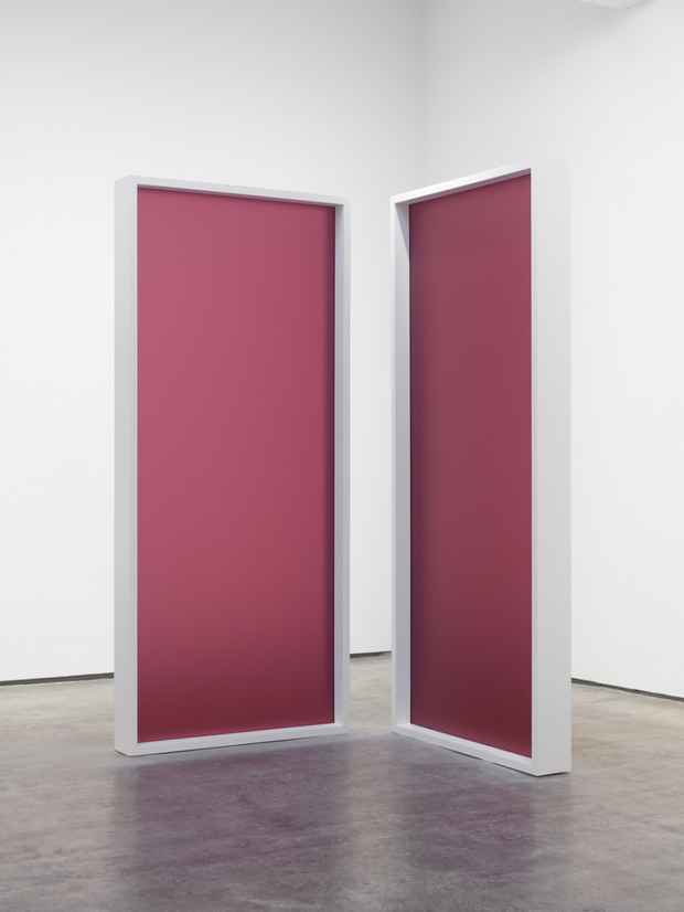
The materiality of color itself is central to works by Liz Deschenes and Michelle Stuart. Deschenes’s sculpture Untitled (LeWitt) #2 (2016) pays homage to Sol LeWitt, specifically a series of Polaroids the artist took of streets of the Lower East Side of Manhattan in 1979. Over the years, the Polaroids faded, leaving magenta the dominant remaining color. In Deschenes’s sculpture, a framed sheet of acrylic printed with magenta ink cured by ultraviolet light, the process of making the work contrasts with the subject of the work: the destructive nature of light. Michelle Stuart’s Quirigua (1980) is titled after the site of an ancient Mayan city in Guatemala known for its sandstone ruins. A pink pigment is rendered from the dirt and stone gathered from the site by Stuart, who embeds fragments of the stone into the paper by pounding and rubbing; the color of the work is inextricable from the site from which it is collected.
Media
Schedule
from January 05, 2023 to February 11, 2023
Opening Reception on 2023-01-05 from 18:00 to 20:00