“Saturated: The Allure And Science Of Color” Exhibition
Cooper-Hewitt, National Design Museum
This event has ended.
Cooper Hewitt, Smithsonian Design Museum presents “Saturated: The Allure and Science of Color,” an exhibition that explores the elusive, complex phenomenon of color perception and how it has captivated artists, designers, scientists and philosophers. Featuring over 190 objects spanning from antiquity to the present, the exhibition reveals how designers apply the theories of the world’s greatest color thinkers to bring order and excitement to the visual world.
“Color has been studied for centuries and yet there is still much to learn about its
properties,” said Caroline Baumann, director of the museum, “From rare first editions of texts
codifying color theory to iconic works from designers who are color masters, manipulating
and materializing truly astonishing effects, the exhibition draws on the extraordinary
collections of Smithsonian Libraries and Cooper Hewitt to examine how design advances our
understanding of what can be achieved when we experiment and innovate with color.”
“Saturated: The Allure and Science of Color” will be installed in the museum’s second-floor permanent collection galleries and is co-curated by Jennifer Cohlman Bracchi, librarian at Smithsonian Libraries, and Susan Brown, associate curator of textiles at Cooper Hewitt, Smithsonian Design Museum. The exhibition expands on “Color in a New Light,” curated by Bracchi and presented by Smithsonian Libraries at the Smithsonian’s National Museum of Natural History in Washington, D.C. from Jan. 2016 to March 2017.
“Saturated: The Allure and Science of Color” is organized into seven sections: Capturing Color, Color Optics, Creating Colors, Navigating Color, Color and Form, Color Collaboration and Consumer Choice.
1
CAPTURING COLOR
Elusive, subjective and complex, color has defied many attempts to capture it. On view in the pages of more than three dozen rare books of color theory are illustrations—spheres, cones, grids, wheels and more—that showcase a dazzling spectrum of efforts to model, systematize and measure color. In Opticks, or, A treatise of the reflections, refractions, inflections and colours of light, 1704, Sir Isaac Newton documents discoveries from his experiments passing light through a prism. In Zur Farbenlehr (“Theory of colors”), 1810, German polymath and philosopher Johann Wolfgang von Goethe challenges Newton’s Opticks with his own theories of how color is perceived by humans.
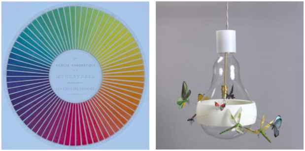
COLOR OPTICS
Many mesmerizing designs make use of eye-popping optical effects that play with perception and illusion. Both the shimmering whorls of Louis Comfort Tiffany’s Peacock vase, ca. 1901 and the brightly winged insects in flight around Ingo Maurer’s hanging lamp J.B. Schmetterling (Butterfly), 2011, dazzle the viewer through the color-shifting property of iridescence.
A disorienting after-image effect adds a psychedelic look to Victor Moscoso’s posters for the Miller Blues Band and Blues Project, 1967. Moscoso credits his Yale professor Josef Albers as an influence for his use of vibrating colors in his work. In addition to a print from Albers’ Homage to the Square, Soft Edge-Hard Edge folio, two color plates from the original silkscreen edition of his 1963 color theory handbook Interaction of Color are on display.
CREATING COLORS
For 40,000 years, artisans colored everything from textiles and paper to ceramics and glass using mineral, animal, plant and insect sources. For instance, in an aryballos created in Syria in the third- to fifth-century A.D., the addition of cobalt to glass resulted in the vessel’s deep blue color, while a huipil from Mexico is colored with dye from a marine snail.
In the 19th century, William Henry Perkins accidentally created the first synthetic dye from coal tar, and the color industry exploded with the understanding that colors could be synthesized in the lab. Today, innovations in materials and technology continue to challenge and inspire color scientists. Through the designer’s use of 3-D printing, Michael Eden’s Tall Green Bloom Urn, 2012, achieves a vivid color impossible to produce with traditional ceramic materials.
NAVIGATING COLOR
In communication design, color can be used as an organizer to call out important information and guide the eye through space. In his 1974 New York subway diagram, Massimo Vignelli used an eight-color palette to color-code the complex system of subway lines.
COLOR AND FORM
Color enables us to understand spatial relationships, but can also deceive the eye. On view are four textile samples from Verner Panton’s 1969 Décor I Series in which a gradation of eight shades of turquoise causes turquoise geometric patterns to appear to project or recede.
2
COLOR COLLABORATION
Designers, manufacturers and their clients need to be able to communicate effectively about color, often remotely. For centuries, designers and manufacturers have produced specialized tools like textile color blankets, sample plates, and shade cards to develop palettes and coordination production. Systems for standardizing and matching colors, like the Pantone color deck, 2014, streamline production and prevent waste.
From fashion to cosmetics to interiors, designers of many disciplines need to intuit what color a customer will want—and even predict which colors will go in and out of style by the time their products hit the market. To help, 40-year-old trend-forecasting agency PeclersParis publishes a biannual Colors Trend Book for designers. Cooper Hewitt visitors are invited to flip through the book and discover which colors PeclersParis predicts will be trending in the spring and summer of 2020. Visitors can also adopt the role of color trend forecaster and develop personalized color palettes via an interactive display.
CONSUMER CHOICE
Color is the most seductive aspect of many consumer products. It can be used to disrupt the perception of a certain type of product or attract a particular type of customer. In 1959, Henry Dreyfus Associates introduced the Signature Princess Telephone in pale pink—a color they hoped would appeal to a newly discovered consumer demographic: teenage girls and young women.
Corporate colorists work not only to bring the most appealing colors to market, but also to develop a recognizable color palette for the brand. The Jonathan Ive-designed iMac Computer, 1999–2000, became the best-selling personal computer in the United States with its bright, translucent case available in five colors named for fruits. On view is “blueberry,” but consumers could also pick grape, tangerine, lime and strawberry colorways.
SPECIAL EVENTS
“Saturated: The Allure and Science of Color” opens to coincide with the fifth edition of
NYCxDesign, New York City’s annual celebration of design, taking place May 11-23. Cooper Hewitt is proud to be a founding cultural partner of the event, which attracts hundreds of thousands of attendees and designers from across the globe and celebrates a world of design.
Media
Schedule
from May 11, 2018 to June 13, 2018