“How Posters Work” Exhibition
Cooper-Hewitt, National Design Museum
This event has ended.
Featuring more than 125 works from Cooper Hewitt, Smithsonian Design Museum’s
permanent collection, the exhibition “How Posters Work” shows how dozens of different
designers—from prominent pioneers like Herbert Matter, Paul Rand, Philippe Apeloig and
M/M Paris, to lesser-known makers—have mobilized principles of composition, perception
and storytelling to convey ideas and construct experiences. On view at Cooper Hewitt from
May 8 through Nov. 15, 2015, the exhibition is organized by Ellen Lupton, senior curator of
contemporary design at Cooper Hewitt.
“A true visual feast, ‘How Posters Work’ features 14 principles of how designers look at the
world,” said Caroline Baumann, director of the museum. “On view in Cooper Hewitt’s Design
Process galleries and on the second floor where our permanent collections are displayed,
this exhibition reveals the design techniques behind some of the most iconic and beloved
posters in the museum’s collection, from the hard-edged designs of Ladislav Sutnar to the
ever popular psychedelic posters of the 1960s, which epitomize sensory overload.”
Housed in the Drawings, Prints and Graphic Design Department, Cooper Hewitt’s collection of
more than 4,000 posters ranges from avant-garde classics to contemporary pieces by
today’s leading graphic designers in the U.S. and abroad. The poster has a long history and a
range of social functions, from selling a product or promoting an event to arguing a point at a
moment in history.
The exhibition will be organized into 14 subsections: focus the eye, overwhelm the eye, use
text as image, overlap, cut and paste, assault the surface, simplify, tell a story, amplify,
double the meaning, manipulate scale, activate the diagonal, make eye contact and make a
system.
Focus the eye
One of the most basic ways designers make a viewer take notice is to make the image big
and put it in the middle of a space, as illustrated in Gottlieb Soland’s 1957 poster
“Grammo-Grafik.” Designers also use color and form to bring attention to a central element,
as seen in Lucian Bernhard’s famous 1909–1910 “Adler” poster, which features a
centered product name at the top, counterbalanced by a starkly rendered typewriter.
Overwhelm the eye
Designers can engage the viewer in an optical experience and lead the eye on a restless
journey by incorporating dense patterns, wandering lines and competing colors. Highlights of
the works on view in this section include psychedelic posters of the 1960s, such as Victor
Moscoso’s 1966 “Junior Wells.”
Use text as image
In poster design, typography is often used to enhance or obscure a message through the
size, style and arrangement of letters. Featured works on view in this section include
Michael Bierut’s 1999 poster “Light/Years” and Josef Muller-Brockmann’s 1959–1960
poster “Der Film.”
Overlap
Designers use various techniques to conjure illusions of depth within the flatness of twodimensional
space. The most basic technique for simulating depth is to overlap two or more
elements, as seen in Paul Rand’s classic 1951 poster “Dada,” which creates a rudimentary
sensation of depth as black letters float in front of white ones. A similar technique is used in
a more elaborate way in Felix Pfäffli’s 2013 poster for the Weltformat Poster Festival
(Lucerne, Switzerland).
Cut and paste
Splitting images apart and combining bits and pieces to create new meaning is central to
the design process. Ladislav Sutnar isolated photographs against bold patterns and flat
fields of color, transforming halftone images into tightly contained illustrations, as seen in
his 1958 work “Addo-x.”
Assault the surface
To focus the viewer’s attention, designers may bend, burn, melt and vandalize the image to
unlock its power. Examples in this section include Fritz Fischer’s 1973 movie poster for Die
Zartlichkeit der Wolfe (The Tenderness of Wolves) and Saul Bass’ 1961 ad campaign for
Otto Preminger’s film Exodus.
Simplify
Designers often simplify an image in order to direct attention to a message or product. In
Waldemar Swierzy’s 1973 film poster for Midnight Cowboy, the simplified image focuses
attention on the figure’s full, ripe lips while blocking his other features.
Tell a story
Visual narratives inspire viewers to ask, “What just happened?” or “What will happen next?”
Featured works in the section include two posters created for the U.S. Office of War
Information during World War II, which tell the same story from different perspectives.
Anton Otto Fischer’s poster “A Careless Word” (1942) depicts a lifeboat loaded with
distressed and wounded sailors pulling away from a burning ship. Frederick Siebel’s
“Someone Talked” (1942) pulls viewers even closer into the story, bringing them eye to
eye with a single sailor who reaches out to them from the dark water just before drowning.
Amplify
Designers may use arresting images and provocative language to communicate the urgency
of a message. Lowercase letters can seem calm and conversational, while uppercase
letters can project anger or agitation, as seen in “No War” by an unknown designer, circa
1980. Images of screaming mouths can trigger visceral, embodied responses in viewers,
as in Art Chantry’s 1982 “Ready for War” poster.
Double the meaning
In order to create humor and tension, designers build multiple meanings into a single image.
This section includes Wiktor Górka’s 1973 poster for Cabaret. Górka, a leading participant in
the Polish School of Poster Art, created a swastika out of dancing legs to promote the Polish
release of Bob Fosse’s famous film.
Manipulate scale
Designers often exaggerate scale differences in order to amplify the illusion of depth or
create visual tension among the elements of a composition. Featured works include
Jacques Delisle’s 1970 movie poster for L’Initiation, which uses a large head to establish a
point-of-view character and smaller elements to suggest thoughts, memories and actions.
Activate the diagonal
Diagonals help the eye cut across the surface and penetrate its depths, as illustrated in the
2008 poster “Jonathan Jones,” in which designer Mark Gowing used angled text to create
three-dimensional letterforms.
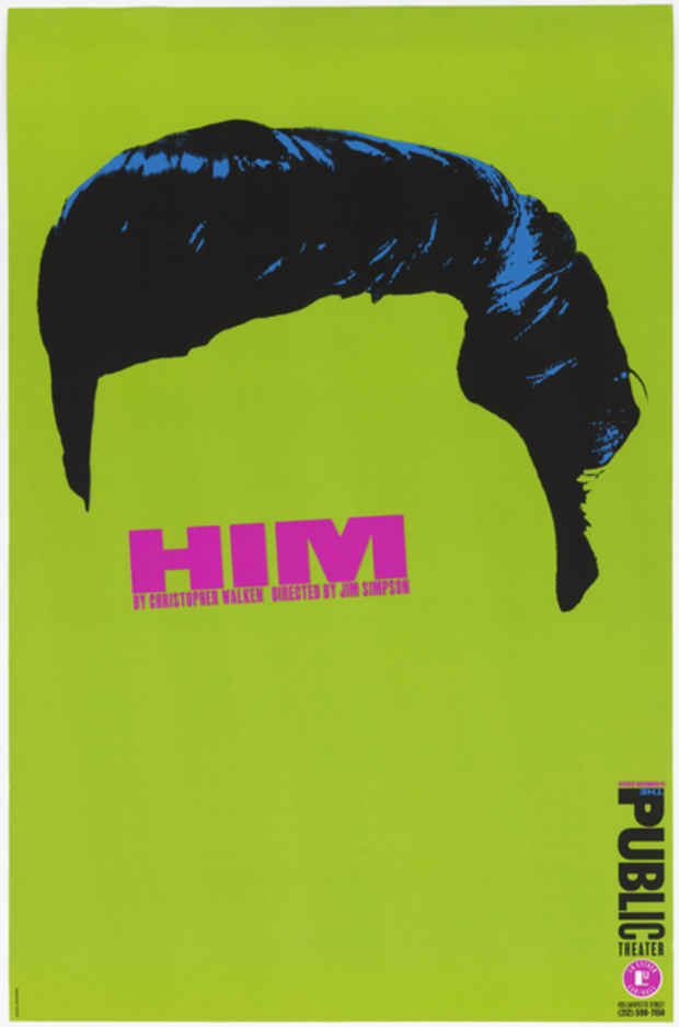
Make eye contact
Graphic designers intuitively grasp the emotional draw of eye contact and the human brain
responds to images of eyes, even when they are hidden or distorted, such as in Richard
Avedon’s 1967 “John Lennon” poster. A face can emerge from minimal ingredients, as
evidenced in Paula Scher’s 1994 poster for “Him” at The Public Theater.
Make a system
Designers create a system of colors and forms to create a recognizable identity and address
spatial relationships among visual elements. Visual systems allow for uniformity and
change, repetition and variation. A contemporary example by Experimental Jetset
showcases a system created for the Amsterdam concert venue Paradiso in which the
designers cut holes into each poster to allow the surface underneath to show through.
Exhibition Catalog
The exhibition will be accompanied by a 224-page catalog, published by Cooper Hewitt, which
serves as a rich primer in visual thinking and demonstrates how some of the world’s most
creative designers have mobilized design principles to produce powerful acts of visual
communication.
Visitor Experience
To increase accessibility, visitors can explore the collection on seven digital tables
throughout the museum with the Collection Browser. The largest tables allow up to six users
to simultaneously explore high-resolution images of collection objects and select items from
the “object river” that flows down the center of each table. Visitors can zoom in on object
details and learn about its history and related objects, which are organized by design theme
and motif. Visitors can also draw a shape that will bring up a related collection object or try
their hand at drawing simple three-dimensional forms.
Shop
SHOP Cooper Hewitt will carry exclusive posters in celebration of the exhibition.
“How Posters Work” is made possible by major support from Adobe Foundation.
Media
Schedule
from May 08, 2015 to January 17, 2016